Responsive Designs and challenges like five column responsive blocks or including Responsive Data Tables.
31 December 2016
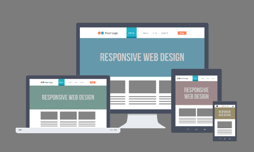
Responsive web designing is an entirely different designing version than traditional web designing, and developers (especially fresher) must know about the pros and cons of responsive web designing. This blog is to reveal a few facts about the uses of responsive web designing. Responsive Web Design concept in a nutshell means offering the same support to a variety of devices for a single website, developing a website design in a manner that helps the layout to get changed according to the user’s device screen resolution. Almost every new client these days would/should want a mobile version of their website.
The old school way to achieve this was having a separate website for each of the devices and redirecting them to a different version of website each accessing a different style-sheet associated to it. For many websites, creating a website version for each resolution and new device would be impossible, or at least impractical. The better approach is to adapt the layout to the viewing environment by using fluid through a combination of proportion-based grids, flexible images, and CSS3 media queries.
Since most of the web users are habituated to use the web through hand-held devices it makes a great sense to optimize the content accordingly. Mobile devices are often constrained by display size and require a different approach to how content is laid out on the screen. Users are used to scroll websites vertically on both desktop and mobile devices - but not horizontally! So, if the user is forced to scroll horizontally, or zoom out, to see the whole web page it results in a poor user experience.
Media queries(CSS3) allow the page to use different CSS style rules based on characteristics of the device the site is being displayed on, most commonly the width of the browser. Using media queries we can deliver specific tailored style sheet to tablets, iPhone, and Androids. Instead of looking for a type of device, media-queries look at the capability of the device. Media queries can be used to check many things, such as:
- -width and height of the viewport
- -width and height of the device
- -orientation (is the tablet/phone in landscape or portrait mode?)
- -resolution
A variety of different screen sizes exist across phones, “phablets,” tablets, desktops, game consoles, TVs, and even wearables. Screen sizes are always changing, and to cope up with it as Designers/developers we must always keep these little Golden Rules in mind.
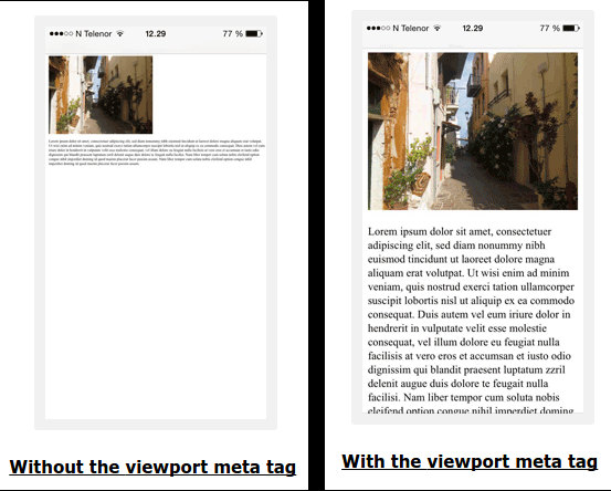
— 1. Adding The meta tag
<meta name="viewport" content="width=device-width, initial-scale=1.0">

— 2. The fluid grid
This concept calls for page element sizing to be in relative units like percentages, rather than absolute units like pixels or points.
Flexible images are also sized in relative units, so as to prevent them from displaying outside their containing element.
Do NOT use large fixed width elements - For example, if an image is displayed at a width wider than the viewport it can cause the viewport to scroll horizontally.
Remember to adjust this content to fit within the width of the viewport.
Do NOT let the content rely on a particular viewport width to render well - Since screen dimensions
and width in CSS pixels vary widely between devices, content should not rely on a particular viewport width to render well.
— 3. Always Think/Design Mobile First
Instead of thinking how the element would look on a computer start thinking about laying it out on mobile.
Mobile First means designing for mobile before designing for desktop or any other device (This will make the page display faster on smaller devices).
Instead of changing styles when the width gets smaller than 768px, we should change the design when the width gets larger than 768px using media-queries to apply different styling for small and large screens. This will make our design Mobile First. An example case:
/*CSS Defaults--optimized for mobiles. All default css goes here*/

img{
  max-width:100%;
}
.logo{
  font-size: 1em;
}

/*Responsiveness with Media-queries as the width increases*/


/*Width Greater than 601px i.e greater than most mobiles--Ranging for tabs*/
@media screen and (min-width: 601px) {
  .logo{
    font-size: 1.5em;
  }
}

/*Greater than most tabs i.e Range of Laptops*/
@media screen and (min-width: 993px) {
  .logo{
    font-size: 1.8em;
  }
}

/*Width Greater than Range of Laptops- Large screen Computers*/
@media screen and (min-width: 1100px) {
  .logo{
    font-size: 2em;
  }
}


/*Some other variations of targeting specific breakpoints*/

/*Width Lesser than Range of Tabs- i.e. Mobiles */
@media screen and (max-width:600px) {}

/*Width Between the Range of Laptops and large mobiles i.e for tabs*/
@media (max-width:992px) and (min-width:601px) {}
Most of the user needs can be catered using some existing CSS frameworks to ease and speed our design process, like Bootstrap the famous CSS framework, or Material Design my new favorite. Either use those css or create your own responsive style-sheets.
Even though these existing frameworks exist to ease our work we often find ourselves struggling in some specific edge cases to achieve fully responsiveness and hence custom media queries come to the rescue. The combination of custom media-queries on top of these existing css frameworks helps in optimizing the layout and achieving responsiveness to great extent. That being said I believe that there is still a lot left as no website can be 100% responsive for every device and needs progressive enhancement day to day.
Using CSS3 Flexbox
Flexible boxes, or flexbox, is a new layout mode in CSS3.
Use of flexbox ensures that elements behave predictably when the page layout must accommodate different screen sizes and different display devices.
For many applications, the flexible box model provides an improvement over the block model in that it does not use floats, nor do the flex container’s margins collapse with the margins of its contents. Learn More at_
Creating Responsive Dynamic Blocks challenge
Parent Element(eg row) sometime needs to include some dynamic number of child elements(columns) and making them responsive sometimes seems to be a headache for web designer. Using existing 12 columns Grid can be hectic. Even if we achieve responsiveness on those columns where the number of column elements are known it can become quite hectic as aligning the items would require offset or specific css selectors. Using Flexbox to create responsive blocks is my idea to achieve responsiveness.
Consider the following cases: ( Tip: The images used in the result section are responsive using flex-box. Resize browser to see them as a live example )
Data Table problem
Pages that include data tables pose a special challenge to the responsive web designer. Data tables are extremely wide by default, and when someone zooms out to see the whole table, it becomes too small to read. When one tries to zoom in to make it readable, he or she is supposed to scroll both horizontally and vertically to look through it. Among the many ways to tackle the problem I like this approach which I found to be more useful.
If you are more interested in learning about Responsive Design I found this talk, by Vitaly Friedman, editor-in-chief of Smashing Magazine to be very resourceful.
(For Intermediate users)
